Usage
In this guide we will use an existing component library that adapts some of the Google Material UI components: formulaik-mui-react. You can also use your custom components library.
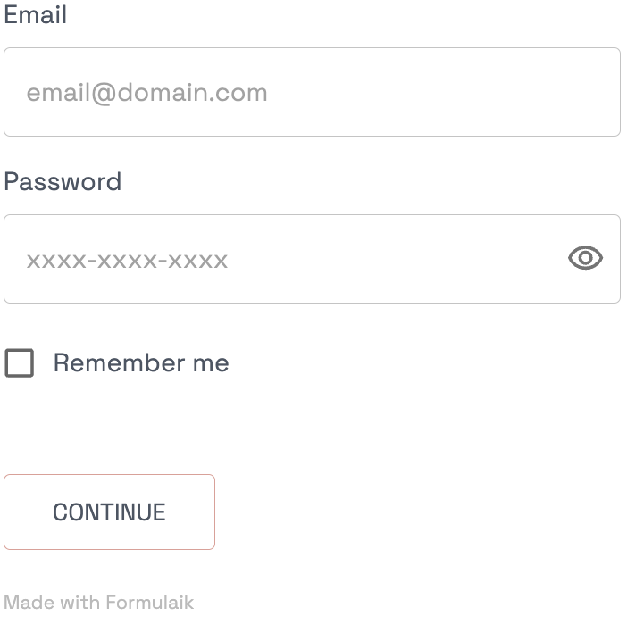
We are going to build this form:

Declare inputs
An input is a JSON declaration for formulaik to show a component referenced by a the component key.
This is where we define what the form will look like, which components it will include and how each one of them will behave.
const inputs = [
{
      component: 'input',
      id: 'email',
      label: 'Email',
      type: "string",
      params: {
        placeholder: "email@domain.com"
      },
      validations: [
        {
          kind: "format",
          value: "email",
          message: 'Invalid email format',
        },
        {
          kind: "required",
          value: true,
          message: "This field can't be blank",
        },
      ],
    },
    {
      component: 'inputPassword',
      label: 'Password',
      id: 'password',
      type: "string",
      params: {
        autoComplete: "current-password",
        placeholder: "xxxx-xxxx-xxxx"
      },
      validations: [
        {
          kind: "required",
          value: true,
          message: "This field can't be blank",
        },
        {
          kind: "matches",
          value: /^(?=.*\d)(?=.*[a-z])(?=.*[A-Z])(?=.*[a-zA-Z]).{8,}$/,
          message: 'Invalid password, must contain at least 8 characters and at most 18 characters',
        },
      ]
    },
    {
        component: 'checkbox',
        id: 'rememberMe',
        type: "boolean",
        params: {
            label: 'Remember me',
        }
    },
    {
      component: 'submit',
      id: 'submit',
      params: {
        text: 'Continue'
      }
    },
]
The input with the
id"email" tells formulaik- to use the
componentwith theemailid - to label the
componentEmail - to expect a
stringdata type - to forward the
paramsto the component, namely the placeholder customization - to use the
validationsrules:format: make sure it's an emailrequired: this field is required
- to use the
The input with the
idpassword tells formulaik- to use the
componentwith thepasswordid - to label the
componentPassword - to expect a
stringdata type - to forward the
paramsto the component, namely the placeholder and the autoComplete customizations - to use the
validationsrules:required: this field is requiredmatches: this field matches the provided regex, if not, display the error message
- to use the
The input with the
idrememberMe tells formulaik- to use the
componentwith thecheckboxid - to expect a
booleandata type - to forward the
paramsto the component, namely the label customizations
- to use the
The input with the
idsubmit tells formulaik- to use the
componentwith thesubmitid - to forward the
paramsto the component, namely the text (label) customizations
- to use the
As you can see the inputs come as an ordered array and are fed to your Formulaik engine of choice. They are:
- Platform agnostic
- Language agnostic
Declare values
values are the default values passed to Formulaik.
You need to match the ids provided in the inputs section.
Here is an example with default values being retrieved from cookies storage:
const values = {
  email: cookies.get('email'),
  password: "",
  rememberMe: cookies.get('rememberMe'),
}
We will use empty values for this guide:
const values = {
  email: "",
  password: "",
  rememberMe: false,
}
Values can also be undefined.
Handle submission
Formulaik was built to make form submission seamless and easy.
Once all the validations have passed, the onSubmit callback is called with the values provided by the user and a few extra options:
 const onSubmit = async (values) => {
    const { email, password } = values
    try {
      await myapi.submit({ email, password })
    }
    catch(e) {
      throw (new Error('Could not sign in: ', e.message))
    }
    return { message: t("Email validated") }
  }
When onSubmit is called a few things happen under the hood:
- The form is in the
isSubmittingstate. This means all your components are disabled, and if yoursubmitcomponent allows it, it will be in a loading state. You have nothing to manage here. - When everything goes well, you can return a JSON object that contain the
messagefield to notify the user the operation succeeded. - In case of an error, simply throw the error. Formulaik will catch it and notify the user accordingly.
Putting it all together
import Formulaik from '@formulaik/react'
import FormulaikMui from '@formulaik-community/react-mui'

const inputs = [
  {
    component: 'input',
    id: 'email',
    label: 'Email',
    type: "string",
    params: {
      placeholder: "email@domain.com"
    },
    validations: [
      {
        kind: "format",
        value: "email",
        message: 'Invalid email format',
      },
      {
        kind: "required",
        value: true,
        message: "This field can't be blank",
      },
    ],
  },
  {
    component: 'inputPassword',
    label: 'Password',
    id: 'password',
    type: "string",
    params: {
      autoComplete: "current-password",
      placeholder: "xxxx-xxxx-xxxx"
    },
    validations: [
      {
        kind: "required",
        value: true,
        message: "This field can't be blank",
      },
      {
        kind: "matches",
        value: /^(?=.*\d)(?=.*[a-z])(?=.*[A-Z])(?=.*[a-zA-Z]).{8,}$/,
        message: 'Invalid password, must contain at least 8 characters and at most 18 characters',
      },
    ]
  },
  {
      component: 'checkbox',
      id: 'rememberMe',
      type: "boolean",
      params: {
          label: 'Remember me',
      }
  },
  {
    component: 'submit',
    id: 'submit',
    params: {
      text: 'Continue'
    }
  },]

export default (props) => {
 const onSubmit = async (values) => {
    const { email, password } = values
    try {
      await myapi.submit({ email, password })
    }
    catch(e) {
      throw (new Error('Could not sign in: ', e.message))
    }
    return { message: t("Email validated") }
  }

  const values = {
    email: "",
    password: "",
    rememberMe: false,
  }

  return <>
      <h3>Login</h3>
      <Formulaik
        components={[FormulaikMui]}
        values={values}
        inputs={inputs}
        onSubmit={onSubmit}
         />
    </>
}
We give a few props to the Formulaik component:
components={[FormulaikMui]}: a list of component libraries to pick the input components fromvalues={values}: Formulaik the default valuesinputs={inputs}: the inputs listonSubmit={onSubmit}: the submission handler
Voilà.
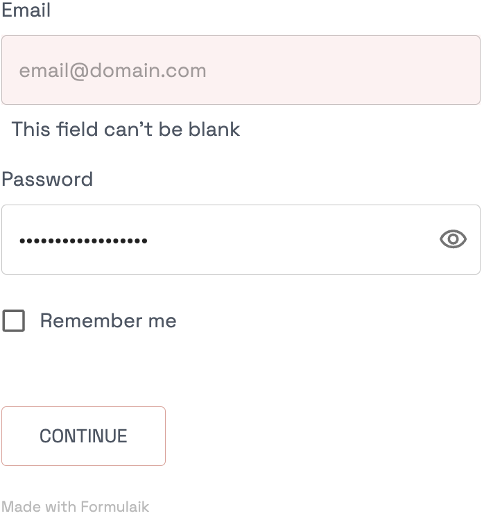
Screenshots
 | Email validation failed |